
Project highlight
Canadian Assisted Travel Society
Giving a mission-led charity a site as clear and generous as the work itself.
Starting Point
Legacy WordPress.com pages that couldn’t just be deleted, a thin brief, and history scattered across the internet’s back catalogue
Client
Denis Vaillancourt – Board Chair
Canadian Assisted Travel Society
my role
Independent research, content rescue, IA, brand identity, and a full responsive WordPress build.
How it came together
01 DIG UP THE HISTORY first –
RESEARCH AND WAYBACK ARCHIVESCATS exists to close one specific gap: for a disabled person who needs a caregiver to travel, the extra cost can be the difference between going and staying home. No brief could have told me that — it shaped which stories made the cut and which lines got rewritten, because that’s the difference between copy that reads like paperwork and copy that reads like Vicki’s trip to Thailand actually mattered. What existed of CATS’ own history was scattered across old WordPress.com pages nobody could log into, several Wayback Machine snapshots taken over the years, and a stack of old documents that had never made it onto any website at all.
02 DECIDE WHAT STAYS –
CONTENT RESCUE AND STRUCTURESome of what I found was worth keeping outright — real testimonials from grant recipients, board biographies with genuine detail, photos from a decade-old fundraiser. Everything else on the site, though, I wrote from scratch — polishing old pages couldn’t fix content that was never really finished. With client input thin on the ground, most of these calls were mine to make. I kept what proved the mission was real and working — the trip stories that showed a grant actually changed someone’s year, board bios that carried decades of lived experience rather than filler — wrote the rest new, and collapsed a dozen wandering, half-finished pages into five that each know exactly what they’re for.
03 Build the whole thing –
identity, copy and website
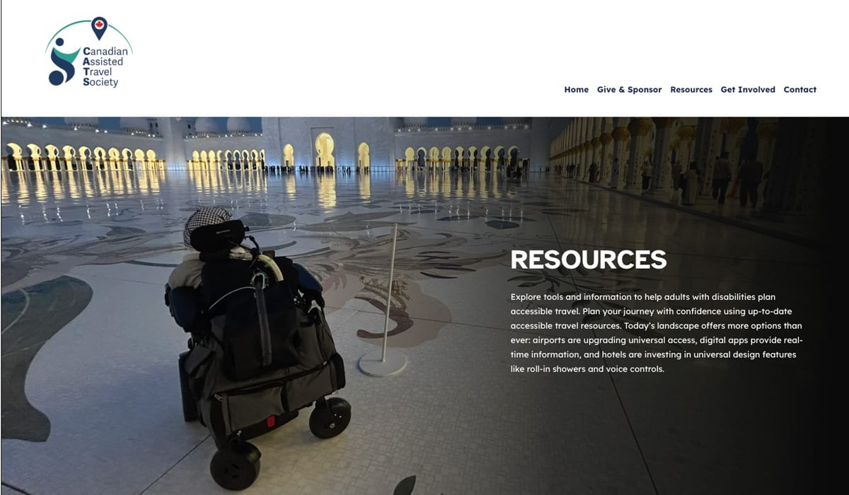
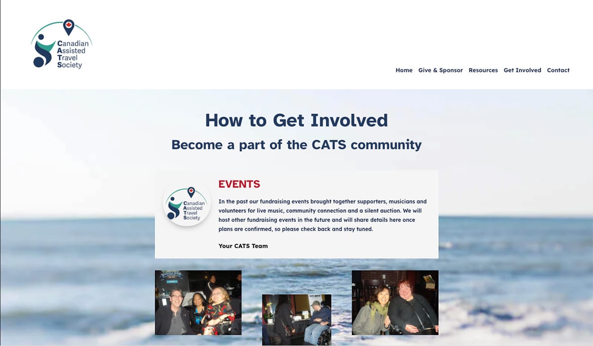
The build came last, and by then the shape of the site already existed in my head: home, giving, resources, getting involved, contact — nothing decorative, nothing orphaned. I built the identity alongside it, since CATS didn’t have one worth keeping, then laid the site out in WordPress and refined it screen by screen, from a widescreen desktop down to a phone held sideways in traffic. Accessibility wasn’t an afterthought — colour contrast, legible type and clear link text got checked at every size, not just the desktop one everyone remembers to test. Nothing here needed to dazzle. It needed to load, make sense, and get someone from “what is this charity” to “how do I help” without a single wrong turn.
Final website samples.
Reclassification, Not Subtraction
Cutting content down to five pages could have meant one blunt pass — keep the popular stuff, bin the rest, done. That’s not what happened here. Every page above got asked the same question on its own terms: not “is this old,” but “does this still do a job for someone deciding whether to trust this charity.” Some pages failed that test outright. Others passed it but were doing half a job split across two separate URLs, so they got merged into something that actually finished the thought. A couple of pages that looked disposable turned out to be the realest evidence on the whole site once they were rewritten properly instead of just kept. None of that is arithmetic — it’s judgment, applied one page at a time, with no client sign-off to lean on and no template dictating what a charity’s site is supposed to include. From that scattered starting point to what it became: the actual before and after, below.
Old Events
2013 Fundraiser
Donate v1
About Us
Board (old)
Links
News
FAQ
Home
Give & Sponsor
Resources
Get Involved
Contact
One Identity, A Decade Of Mismatched Material.
Nobody photographed this charity’s history with a website in mind. I had to build one anyway.

22395d
33998e
ca2a24
Headings / 700
Atkinson Hyperlegible
Body / 400.
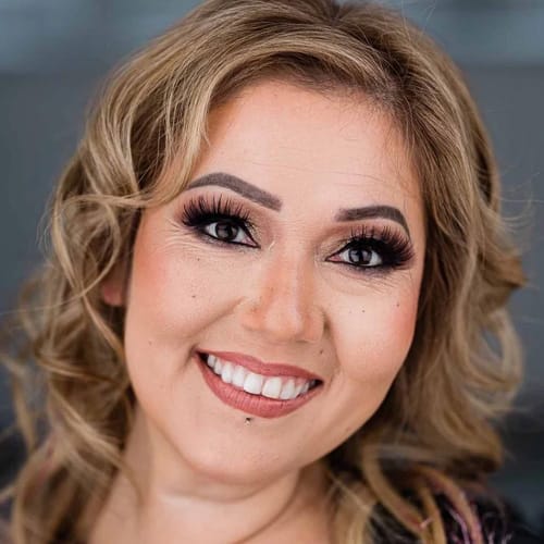
Close-up — a personal photo, not a travel shot
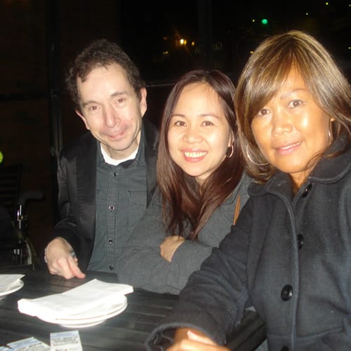
2013, indoor, event snapshot, a little grainy

Studio headshot, dark background, suit and tie
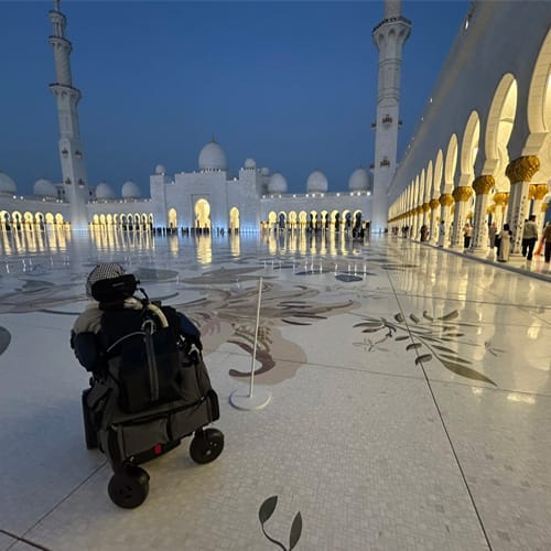
Blue-hour, cinematic — the site’s own hero image
Built to hold together, not to match
None of these were shot for this website. There was no budget or timeline to send anyone back to 2013 with a proper camera — the photos that existed were the photos I had. The job wasn’t to make four wildly inconsistent images match each other. It was to build a site clean and structured enough that they could sit in it without the whole thing reading like a scrapbook.
THE RESULT
Rescued from pages nobody could log into, and rebuilt for people who already have enough friction in their day. Five clear destinations, written from scratch, working on any screen.