Project highlights
ICAN Resource Group
The design challenge: a multi-disciplinary visual brand for a Canadian business focusing heavily on accessibility.
Client
Ean Price, CEO
ICAN Resource Canada
Components
Branding
Content
Web Design


Creative thought
Focusing only on one target audience is not an option any longer.
Anything that is produced can reach anyone, anywhere.
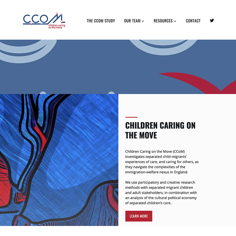
Brief intro
Accessibility was king from the outset. A black and white colour scheme can generally provide a high level of contrast, but it’s important to note that the best color combination for ensuring the highest accessibility depends on many factors. Contrast accessibility is primarily determined by the difference in luminance (brightness) between text and background colors. While black text on a white background tends to offer a strong contrast, there are alternative color combinations that can also achieve excellent accessibility. However the client decided to use black and white as the base requirement because he also favoured it aesthetically.
The Logo
The ICAN logo, with its bold sans serif lettering, symbolizes the essence of this project’s mission. The deliberate focus on the letter A, resembling a triangle, represents strength, resilience, and progress. The small gap signifies the journey towards inclusivity, acknowledging that even with assistive technology and accessibility advancements, there may still be obstacles to overcome. This design embodies the spirit of diverse businesses uniting to empower individuals with disabilities, bridging gaps and transforming challenges into opportunities. It captures the dynamic nature of this project, inspiring change and championing a future where everyone can thrive.
Website
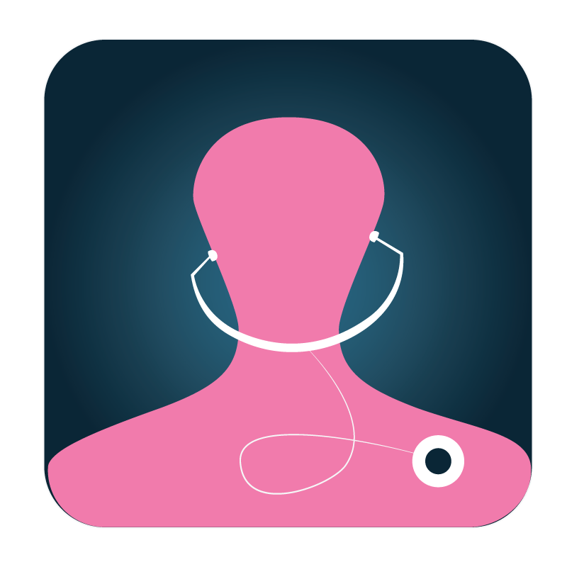
icanresource.ca is a dynamic platform that showcases diverse businesses specializing in branding, website design, and content creation. It also highlights travel stories, opportunities, and invaluable tips for traveling individuals with disabilities. Furthermore, it promotes innovative assistive technology, particularly an automated oral suction device, empowering individuals to regain independence. The website’s black and white branding, subtly complemented by colorful photos, creates a visually appealing experience. Through discreet color coding, each branch of the business is distinct. Overall the site let’s visitors discover a world of creativity, accessibility, and empowerment.
More Projects