Project highlights
Clinic “Queue Manager” App
This application allows health care providers and clinic staff to manage the flow of patients through different stages of their visit. Visual design uses colour, layout and iconography for an intuitive user experience.
Client
Sam Brown
Santa Rosa Clinic, NM, US
Components
UX Development
UI Design
Creative Thought
UI and UX are often misunderstood terms.
UX: how the user operates an interface.
UI: graphical layout and components of an app.
Brief intro
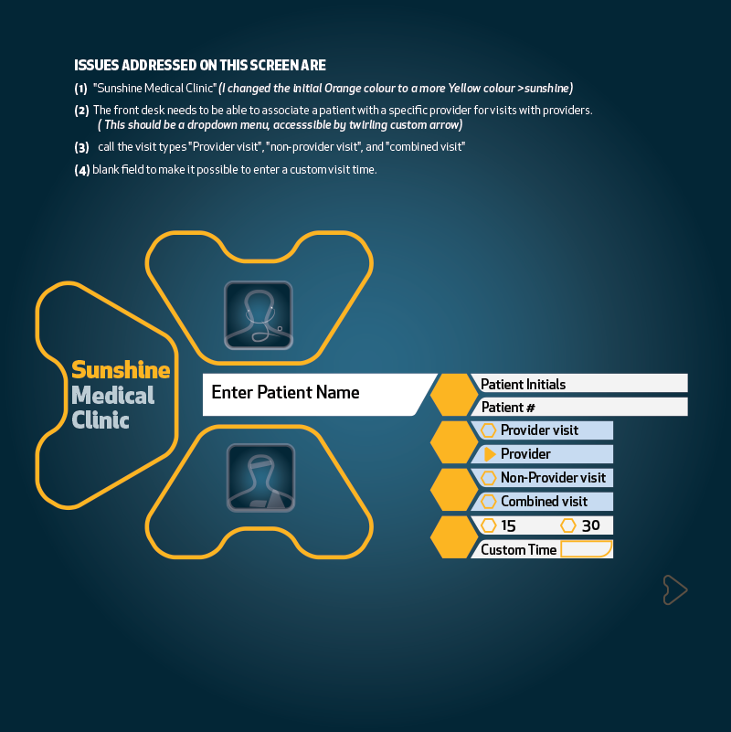
The client’s key measure for success was keeping staff interaction with the app at an absolute minimum while allowing for maximum data capture. This was the top priority during both UI design and UX development stages.
UX Development
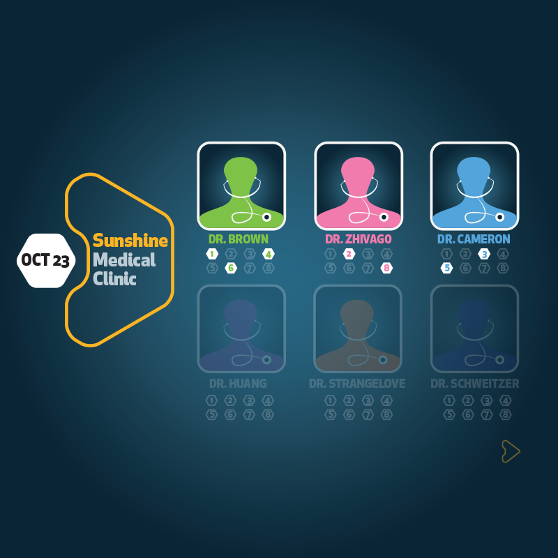
Architectural drawings and photographs of the clinic were used to determine the amount and location for the app interfaces: three were placed in the clinic and two at the check-in desk. The app required multiple functions and included a diversity of participants. The logic of the workflow was developed and tested with staff and a project developer.
UI Development
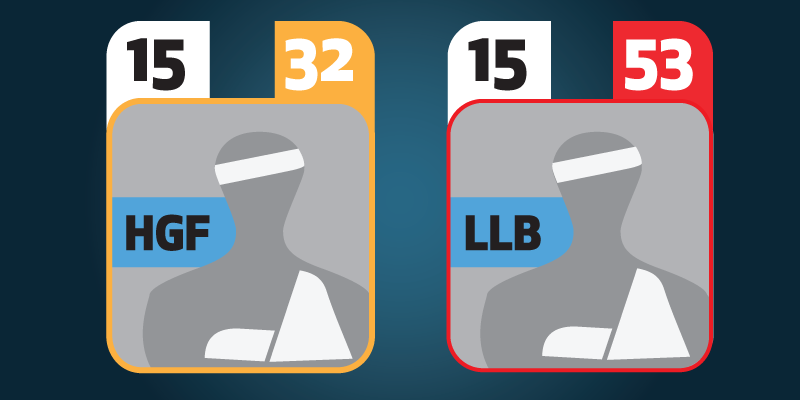
Two sets of gender-neutral icons were developed to represent individual staff members as well as the patients. Colour was the primary distinction. The first letters of each person’s name was added in later iterations in case of colour blindness. Blue was chosen as the overarching colour, representing trust and dependability. Rounded edges mirrored the soft edges of furniture in the clinic.
More Projects