
Project highlight
Positive Living BC
Nineteen years, one designer, and every piece of paper the place ever sent out.
Starting Point
A community HIV organisation, a bi-monthly magazine and no design department. Hired half-time for the magazine alone
Employer
Positive Living BC (formerly BCPWA), 2001–2020. Full-time within six months, at the board chair’s insistence
My role
Art director and production manager. Layout, pre-press, identity, and every printed thing in between
How the magazine came together
01 Make do –
Photography, scans and Photoshop
Every issue needed pictures, and the image budget was zero. So the images were mine: my own photographs, Photoshop and Illustrator concoctions, and scans of whatever was lying around. Including, once, a slice of Swiss cheese. Six issues a year, one designer, and a non-profit’s skinny budget turned out to be a surprisingly good creative brief.
02 Grow, shrink, repeat –
16 to 40 to 28
Sixteen pages, then 24, then 40, then back down to 28. Funding set the ceiling, and a volunteer pool of writers decided how much of it we could fill. Our editor was a perfectionist, and the magazine was better for it, so the copy that reached me was worth designing around. The grid bent without breaking. Canva, eat your heart out.
03 Get it to print –
Pre-press and printers
I’d finished part of a printing certificate and pre-press turned out to be my strong suit. My files went to the printer ready to run, and he never once had to call me for corrections. Before me, his pre-press department had spent so much time fixing incoming files that he was ready to stop working with the magazine. He stayed. Clean files will do that.
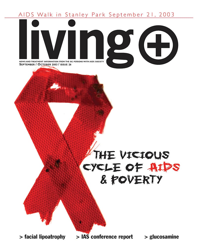
Living+, September/October 2003
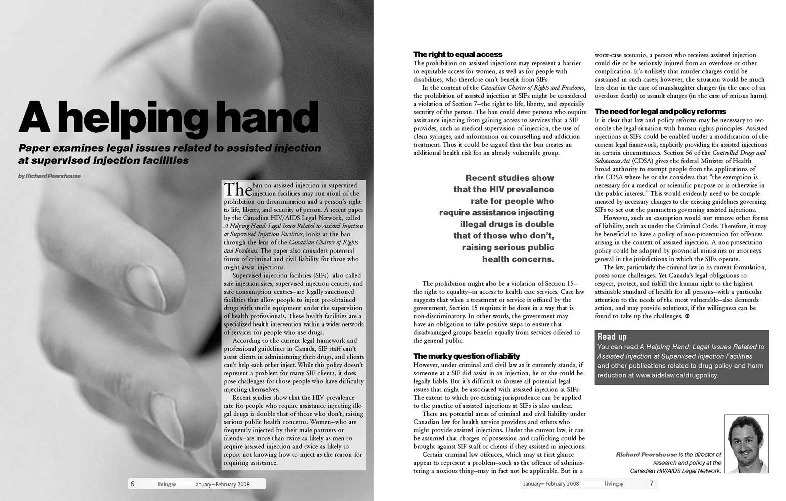
Living+, January/February 2008, sample spread
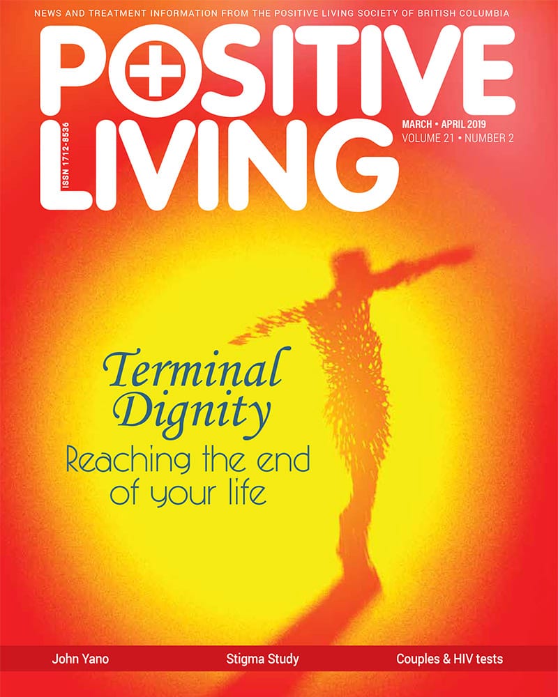
Positive Living, March/April 2019
Two rebrands, two brouhahas
First the BCPWA logo changed, and every piece of material had to follow. The new mark was a compromise, and I’ll leave it there. Then it all changed again, to Positive Living BC, and the magazine went from Living+ to Positive Living. Same drill, but 10 times louder opinions.
1. The original

2. The compromise

3. Positive Living BC
Everything else
Posters, multi-page reports, health manuals, stationery, conference abstracts, banners, fundraising campaigns. At one point the organisation had about forty staff, and I was the only person doing this job.
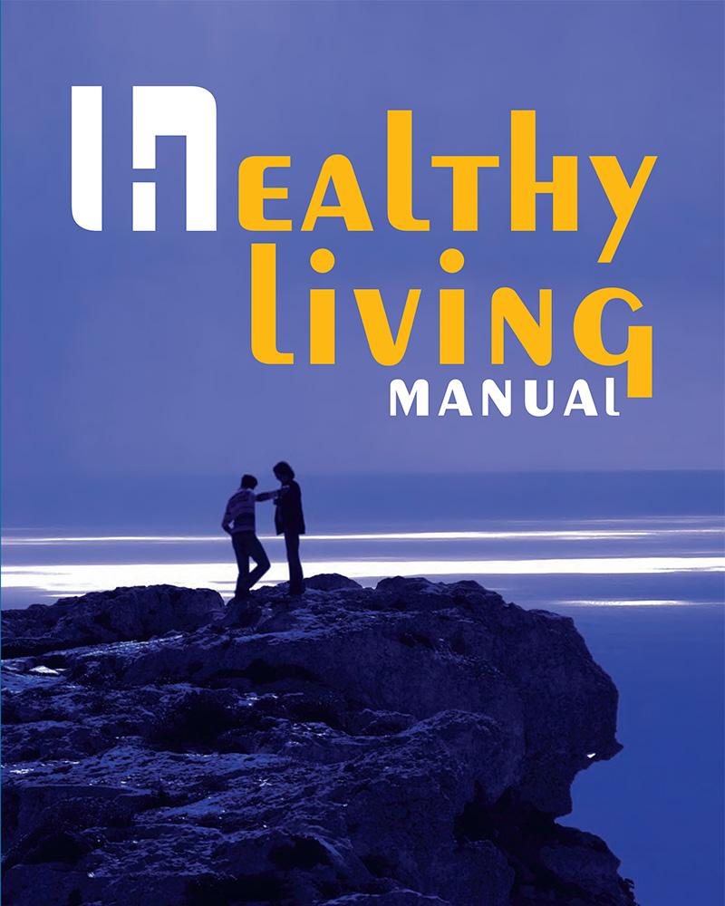
Healthy Living Manual, 2008
Read the PDF (3.2 MB, opens in a new tab)
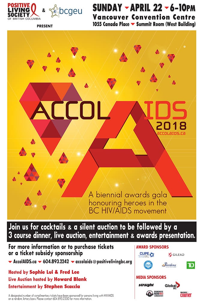
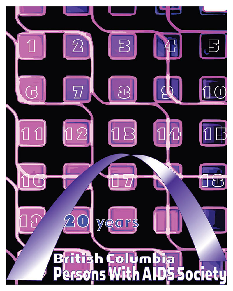
20 Years of BCPWA
Read the PDF (4.9 MB, opens in a new tab)
Shot by me. Said plainly.
BCPWA created a Positive Prevention Director position before anyone else did. He wanted work that didn’t flinch, so I found the people, found the locations and took the photographs. One campaign about sex, for HIV-positive gay men. One booklet about tattooing, for people in prison. Plain words, honest pictures.
Four posters. One booklet. Zero stock photos.
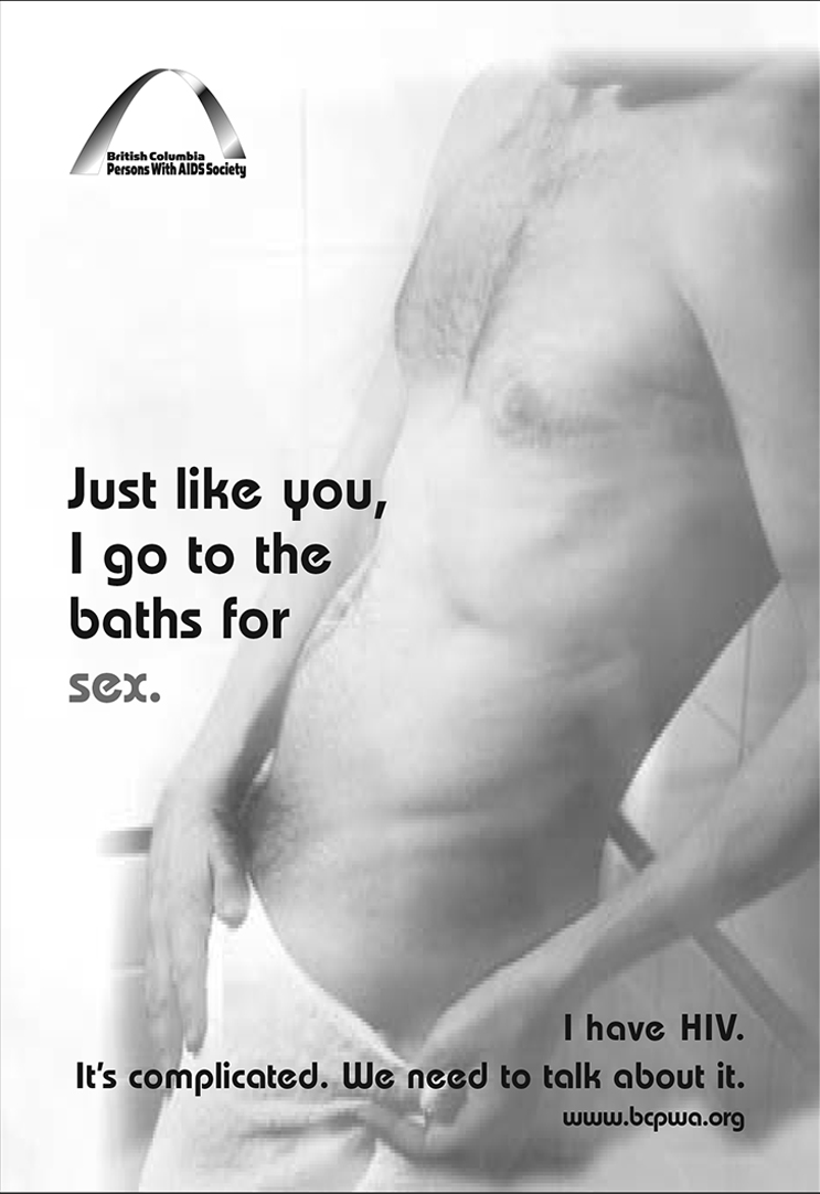
Just like you
December 2002: four posters and postcards, one message. HIV-positive gay men have sex, fall in love and take risks like everyone else, so we need to talk about it. This was one of the first prevention campaigns in Canada to include positive gay men in its messages. As far as photoshoots went: never forgotten.
“Just like you, I go to the baths for sex.” BCPWA Positive Prevention Campaign, 2002. Photography, design and production.
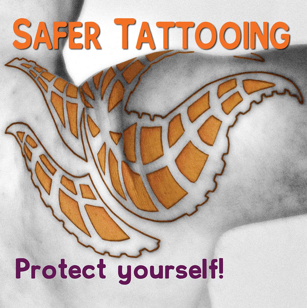
Safer Tattooing
Read the booklet (PDF, 1.7 MB, opens in a new tab)
A short booklet for Positive Living’s Prison Outreach Program, a collaboration between various departments and volunteers, for people who get tattooed inside, where there’s no studio and no sterile kit. Hepatitis C and HIV travel on shared needles and ink, so the advice starts from what’s actually to hand and covers the needle, the ink, a good day for a tattoo, safe disposal and aftercare. The cover uses color. Inside, the budget stopped at black.
Safer Tattooing. Prison Outreach Program, Positive Living Society of BC, 2015. Photography, design and production.
112 issues later
Issues 13 to 124, then the doors closed at the start of COVID. Pure print work won’t come back. But my habits will stay: make it clear, make it ready, make it with what you have.